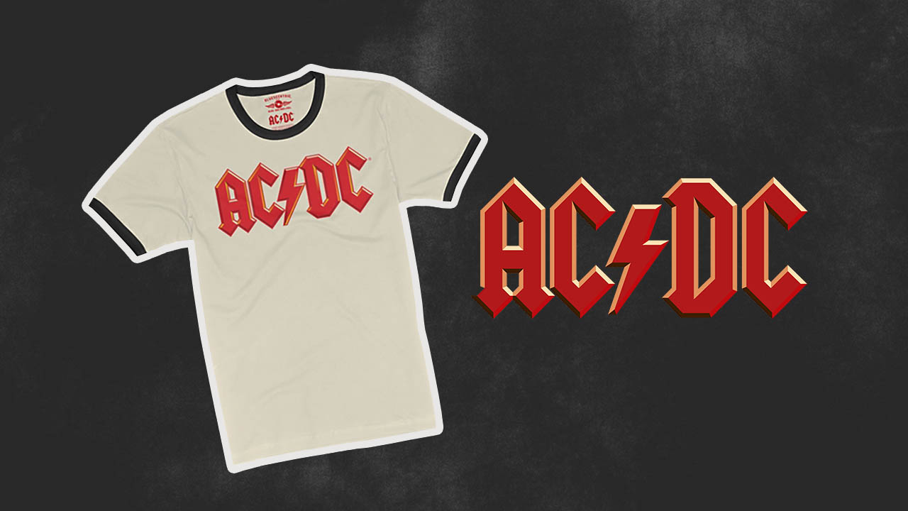
Few logos in rock history are as instantly recognizable and iconic as the AC/DC lightning logo. This story dives into the origins of a design that’s not only visually striking but has become a symbol of rock and roll rebellion across generations. From its humble beginnings to its evolution into a global phenomenon, let’s break down the story behind this electrifying logo.
Origins Of The AC/DC Lightning Logo
The AC/DC lightning logo wasn’t born overnight. It all started in 1977 when the band’s record label, Atlantic Records, hired a young designer named Gerard Huerta. At just 25 years old, Huerta was tasked with creating a new logo that captured the energy and raw power of AC/DC’s sound.
What’s particularly interesting is where Huerta drew his inspiration: the Gutenberg Bible—one of the first printed books in history. He adapted the Bible’s Gothic-style lettering, but gave it a bold, angular twist to mirror the band’s hard-hitting rock vibe. With sharp edges and a lightning bolt splitting the “AC” and “DC,” the logo became the perfect representation of the band’s music.
The Evolution Of The AC/DC Lightning Logo
Before the famous logo, AC/DC went through a few different designs:
- 1974-1976: A bold, stencil-style logo with a red lightning bolt.
- 1976: A serif font with inclined letters and a white lightning bolt.
- 1976-1977: A handwritten-style logo that replaced the bolt with a slash.
It wasn’t until the release of their 1977 album, Let There Be Rock, that Huerta’s lightning logo first made its debut. However, even then, the band didn’t fully commit to it right away. They flirted with a hybrid design on their 1978 album Powerage before ultimately sticking with the iconic logo for good by the time Highway to Hell dropped in 1979.
Since then, the AC/DC lightning logo has become synonymous with the band, appearing on nearly all of their studio albums and a wide array of merchandise.
A Merchandising Powerhouse
Today, the AC/DC lightning logo is more than just an album cover—it’s a merchandising juggernaut. Studies have shown that AC/DC’s logo t-shirt is the most popular band tee in the world, even beating out legendary groups like Queen and Pink Floyd. It’s hard to walk into a concert, music festival, or even a mall without seeing someone rocking this timeless tee.
The logo doesn’t just sit on t-shirts, either. From hats to posters to accessories, the lightning bolt has become a standalone icon that represents rock music itself.
Design Elements: What Makes It Work?
A big part of the AC/DC lightning logo’s success is in its details:
- Typography: The font is custom Gothic with geometric serifs, giving it a powerful, almost ancient vibe. It’s reminiscent of medieval script, but with sharper, more aggressive lines.
- Color Scheme: The most common version is black on a white background, which adds to the logo’s stark, bold look. But you’ll also find the logo in a range of color variations.
- The Lightning Bolt: The lightning bolt separating “AC” and “DC” is iconic on its own. It’s even used independently on merch, signifying the raw, electric energy of AC/DC.
A Tale Of Success And Controversy
While the logo has become an unstoppable force in the world of rock merchandise, there’s a surprising twist in the story. Despite designing one of the most commercially successful band logos ever, Gerard Huerta has never been directly contacted by AC/DC or compensated beyond his original payment for the Let There Be Rock album cover. This opens up a larger conversation about fair compensation for designers in the music industry—an issue that still resonates today.
The Enduring Legacy Of The Lightning Logo
Decades after its creation, the AC/DC lightning logo continues to electrify fans around the world. Its influence can be seen not only in rock and metal branding but also in tattoo culture, where many fans choose to ink the lightning bolt as a permanent symbol of their connection to the band.
Even as trends in music and fashion change, this logo remains timeless. It has outlasted passing fads and continues to be featured on new merchandise, serving as a reminder of the enduring appeal of both AC/DC and rock and roll itself.
Why The AC/DC Lightning Logo Remains Iconic
The AC/DC lightning logo is more than just a band emblem—it’s an enduring symbol of rock and roll’s rebellious spirit. With its Gothic-inspired design and bold lightning bolt, it has captured the imagination of fans for decades. Whether seen on t-shirts, tattoos, or album covers, this logo continues to stand out in the world of music merchandise, proving that timeless design has the power to transcend generations and trends.


