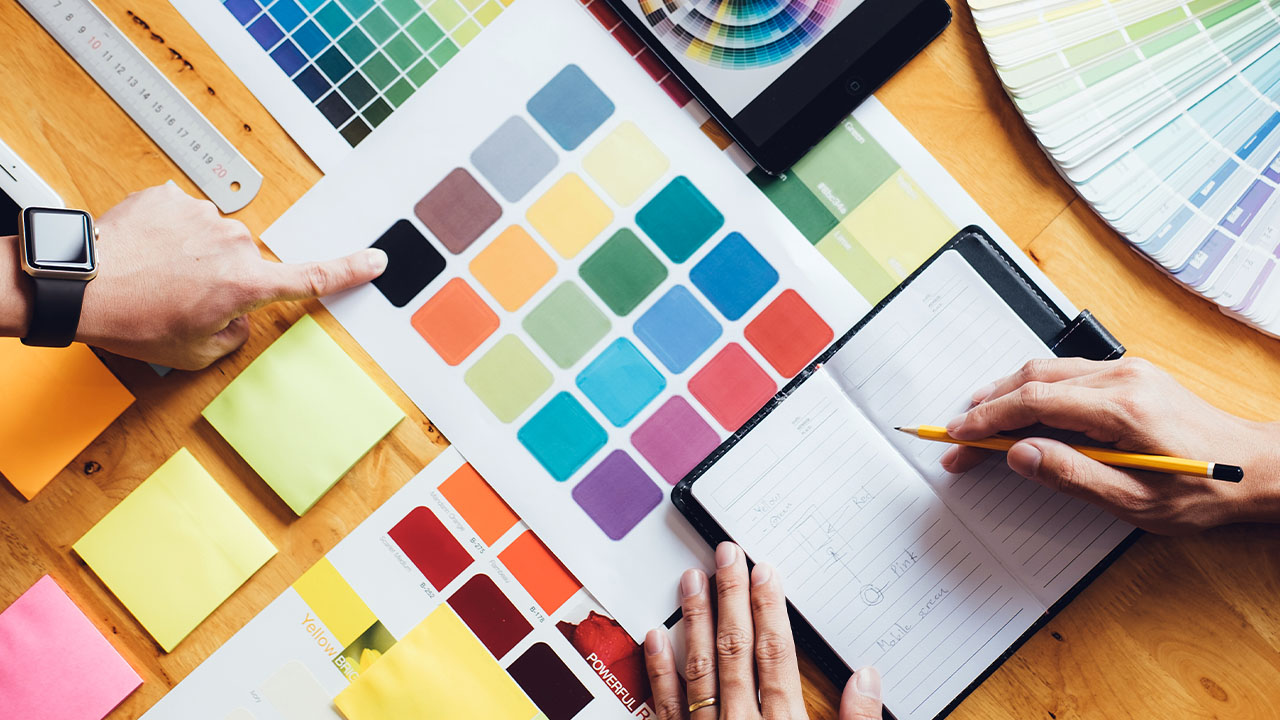
Pantone is the most famous name in color. The company has been around since the 1960s, and it still defines what we think of when we imagine a certain shade. From Pantone colors paint chips to Pantone screen printing inks, the brand keeps expanding its reach — so much so that you might think they’ve completely taken over.
From eCommerce to coffee shops and beyond, here are the Pantone colors we love and the brands behind them.
- Amazon
- Barbie
- Coca-Cola
- John Deere
- Ikea
- Starbucks
- Xbox
Amazon
Amazon is the largest online retailer in the United States, with over 50 percent of US online shoppers using Amazon’s site as their destination for purchases. The company got its start as a small online bookstore in 1994 but has since grown into much more, offering everything from groceries and clothing to electronics and home goods
Amazon’s logo was designed in 1999 by co-founder Jeff Bezos and is meant to represent a smile. The color scheme of blue and yellow was inspired by Brazil’s flag; Bezos had been visiting Brazil at the time he created it.
Amazon Pantone Colors
PMS 1375 C
Amazon Orange
PMS Process Black
Black
Barbie
You’ve almost certainly seen the Barbie’s pink. The iconic doll has been around since 1959, when she was introduced as part of the “Models of Today” collection by Mattel. Since then, Barbie has evolved into a cultural icon—but it’s her wardrobe that we’ll focus on here.
Barbie pink has become synonymous with a brand that sells more than 150 million dolls each year (that’s approximately one every second). In fact, Barbie’s distinctive look has inspired fashion designers over the years—and even influenced an entire generation of girls who grew up playing with these iconic toys!
Barbie Pantone Colors
PMS 219 C
Vivid Cerise
Coca-Cola
If you’re a fan of Coca-Cola, then you know the iconic drink is not just any old soda. Coca-Cola is an American classic that can be enjoyed by all ages—and we’ve got the color to prove it!
Coca-Cola has been around for more than 100 years and is one of the world’s most popular beverages. It was created by Dr. John Pemberton (who also invented Pepsi) in 1886, but wasn’t mass produced until 1894 when Asa Griggs Candler purchased the formula from Pemberton’s son. The distinctive dark red color is known across America as an indicator of Coca-Cola branding and has become synonymous with everything from vintage advertising materials to modern graphics depicting rays of sunlight shining through a glass bottle filled with liquid happiness (not literal).
Coca-Cola Pantone Colors
PMS 1788 C
Coke Red
John Deere
John Deere is a brand of agricultural equipment, so it makes sense that the company’s color palette is comprised of green and yellow. These two hues appear on everything from tractors to golf carts, but they’re most commonly found in the company’s logos.
The John Deere green was officially introduced as a corporate color in 1985 when John Deere merged with the International Harvester Company (IHC). At the time of their merger, IHC had been using green as its official corporate color since 1892. Under IHC’s guidance, the new combined entity continued using this shade for many years after the merger took place. Today, John Deere uses variations on both colors throughout their marketing materials: light or dark greens along with yellows can be seen splashed across everything from baby onesies to rakes at hardware stores around the world!
John Deere Pantone Colors
PMS 364 C
John Deere Green
PMS 109 C
John Deere Yellow
Ikea
Ikea is a Swedish home furnishings retailer, with locations in over 60 countries. Its most recent brand refresh was in 2015, when it updated its logo and color palette. The brand’s official colors are yellow and blue, which they use across all of their stores and marketing materials. The bright bold hues can be seen on everything from shopping bags to flooring tiles, allowing customers to associate the brand with excitement, energy, and fun.
Ikea Pantone Colors
PMS 7455 C
Ikea Blue
PMS 107 C
Ikea Yellow
Starbucks
Starbucks is a popular coffee shop, restaurant, and coffee roaster with around 25,000 locations worldwide. You can find it in almost every country across the globe!
The company has a long history of using Pantone colors in its logo and marketing materials. The Starbucks logo uses green because it’s said to be soothing and relaxing. Green also symbolizes health and vitality (think of grass) which are qualities that people associate with Starbucks’ products. The word “Starbucks” is written in a beautiful script font that looks very elegant but legible at the same time!
Starbucks Pantone Colors
PMS 3425 C
Starbucks Green
Not Available
White
Xbox
The Xbox is a video game console that was first released in 2001. Its official color is green. This color can be seen on their logo as well as within their software.
The color green is also used to represent an open mind and a welcoming attitude. The brand uses this specific shade of green in order to emphasize their association with nature and technology, which they believe are two things that should coexist with each other without conflict or opposition.
Xbox Pantone Colors
PMS 362 C
Xbox Green
The Takeaway
We hope you found this post helpful and informative. We believe that color is an essential part of branding, and we’re excited to see how brands continue to explore new color combinations and make them their own. We can’t wait to see what new Pantone colors are coming out!

